


: A Wave of Negativity Sweeps In")


Preslav Kateliev from Phone Arena shares his experience after using the iPhone 16 Pro Max for a month, highlighting his mixed feelings about the Dynamic Island feature.
After a long hiatus from iPhones, Preslav Kateliev from Phone Arena inserted his SIM into the iPhone 16 Pro Max for a month-long trial. While he was captivated by the Liquid Glass software and titanium body, he found himself surprisingly dissatisfied with the Dynamic Island—a signature feature on newer iPhone models.
Counterintuitive Widget Mechanics
The Dynamic Island introduces multitasking to iOS, displaying active widgets near the camera. However, its interaction logic feels backward.
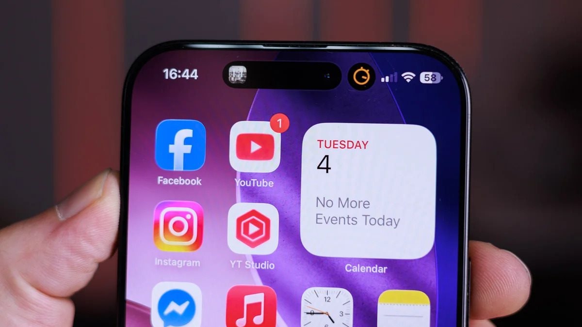
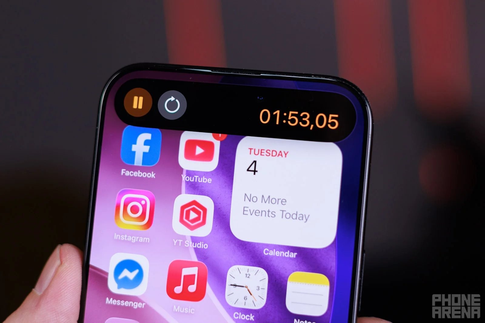
At first glance, the Dynamic Island seems innovative, adding multitasking capabilities to iOS. Active widgets appear as icons beside the selfie camera, offering quick access to controls. For instance, a music playback widget displays sound waves. Tapping it once, however, abruptly stops current tasks and launches the music app full-screen—a jarring interruption.
Shouldn’t the Dynamic Island prioritize speed and convenience? A single tap should reveal the widget, while a long press should open the full app. Apple’s reverse approach feels illogical: quick access requires a slower interaction.
Interferes with Scroll-to-Top Gestures
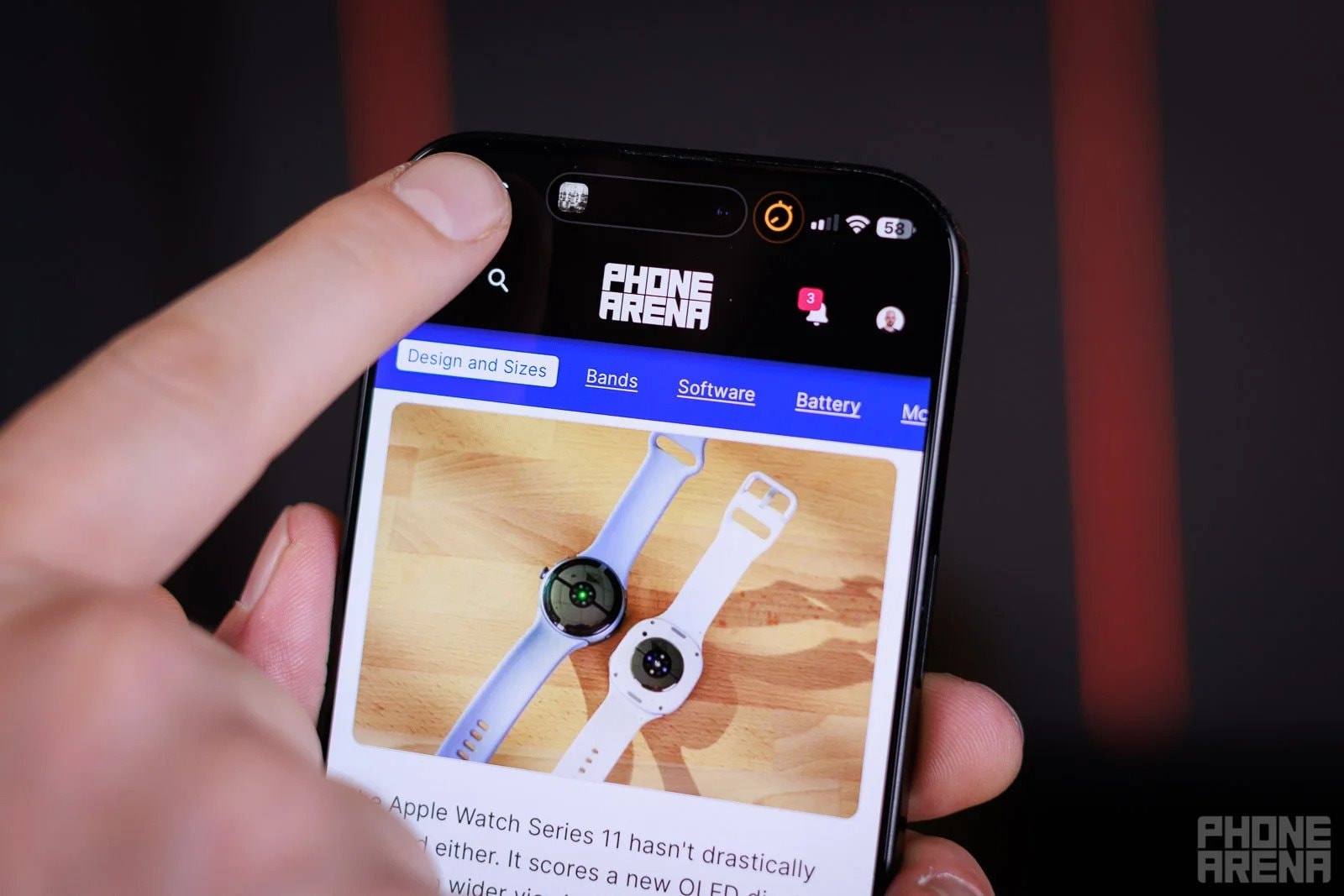
The Dynamic Island’s placement disrupts the intuitive scroll-to-top gesture, often triggering unintended app switches.
iOS’s scroll-to-top gesture—tapping the screen’s top edge—is a longtime favorite. However, with an active Dynamic Island widget, this gesture becomes risky. Accidental taps launch unrelated apps instead of scrolling, breaking a deeply ingrained habit.
Smudges the Selfie Camera
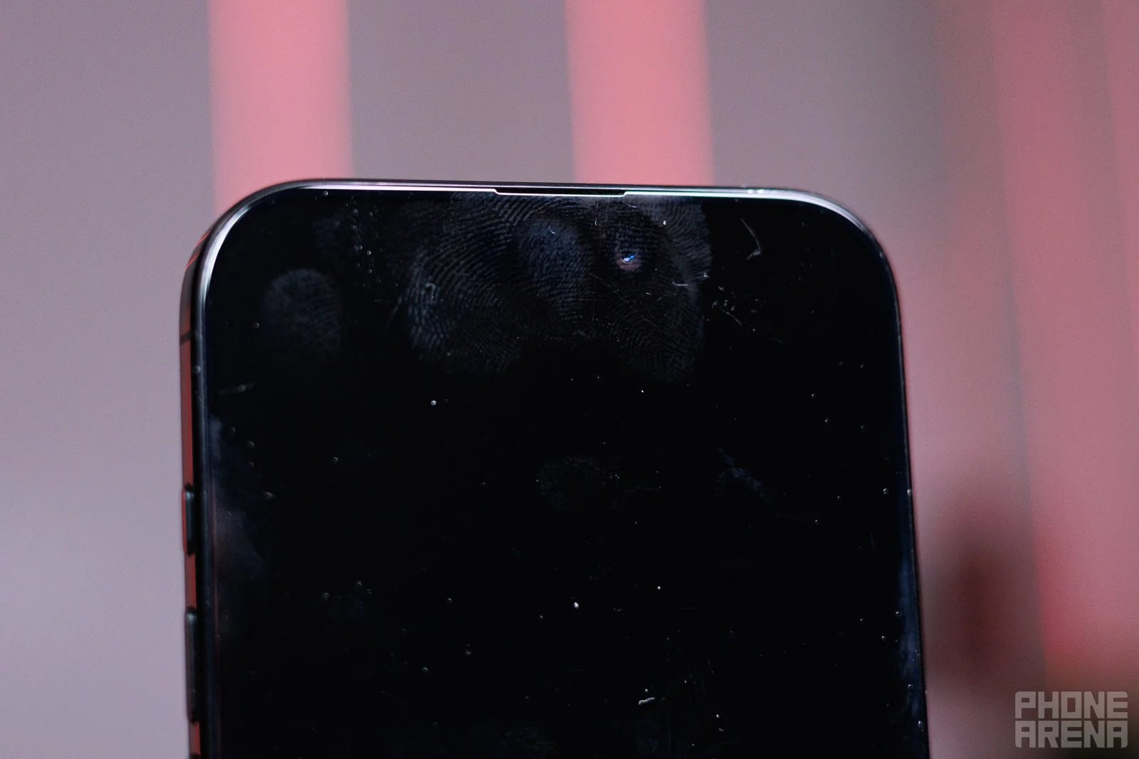
Placing an interactive element over the selfie camera invites smudges, despite the Dynamic Island’s slightly wider design.
Positioning an interactive zone directly over the selfie camera is impractical. While technically wider than the Face ID module, precise taps between the camera and sensor are unrealistic. Fingerprints on the lens become inevitable, detracting from photo quality.
Samsung’s Superior Implementation

Samsung’s Now Bar in One UI 7 offers a more user-friendly alternative to the Dynamic Island.
Samsung’s Now Bar, introduced in One UI 7, mimics the Dynamic Island but with key improvements:
- On the lock screen or always-on display, it moves to the bottom for one-handed accessibility.
- When unlocked, it resides in the top-left corner, avoiding the camera area.
- A single tap expands widgets, while a second tap opens the full app—a logical progression.
Will Apple Revise This Design?
Apple resists altering established user experiences, as seen with outdated features like shake-to-undo. Despite newer alternatives (e.g., three-finger tap), old habits persist. Thus, hopes for Dynamic Island improvements are slim.
While not deal-breaking, the Dynamic Island’s flaws are perplexing. Its current design feels like a missed opportunity for seamless integration.


